From bearish to bullish: giving Obiex’s web app a fresh new look.
This redesign was a full visual and functional overhaul of Obiex's web application. It aimed to simplify how users buy, sell, and manage crypto, while giving the interface a clearer structure and more intentional personality.
web app

too long, won't read all of that
my Role(s)
led redesign strategy and direction
Led design system development from scratch
Created and maintained detailed design documentation for handoff and scaling
Conducted UI/UX research and established core design patterns for the new web app
co-conspirators
luke & adekunbi
three key Results we achieved
the new design made the platform easier to navigate, leading to 30% increase in user activity and more users completing core actions like buying and selling.
we achieved 25% drop in user support requests after redesigning confusing flows and clarifying system feedback.
New features are seeing quicker uptake thanks to improved visibility and onboarding cues.
We promise this is no normal case study. As you scroll through, it may get goofier. So we must warn you in the words of Warsan Shire
“my otherness will spoil you, ruin you, after me, all else will taste redundant”
A brief intro, shall we?
Obiex is one of the largest crypto exchanges that serves people from diverse corners of the world. With the clear aim to drive widespread adoption of cryptocurrency, it provides security and seamlessness.
With this in mind,
Simplicity drives all our UX and UI contributions to the product, and we hate it!😀 It makes our job 10x harder than it would have been if we don’t have to worry about making sure everyone can use our products.
jk, jk, we love it for the same reason.
We’ll go ahead and admit it. This redesign was first and foremost an ego trip for the design team 👀
Naturally, our skills had far surpassed the current designs, which were created as the first MVP. We couldn’t tell peers we work at Obiex without cringing a few times.
Beyond that... the company was growing too and it had become important for us to update our designs to represent the current trajectory of the company.
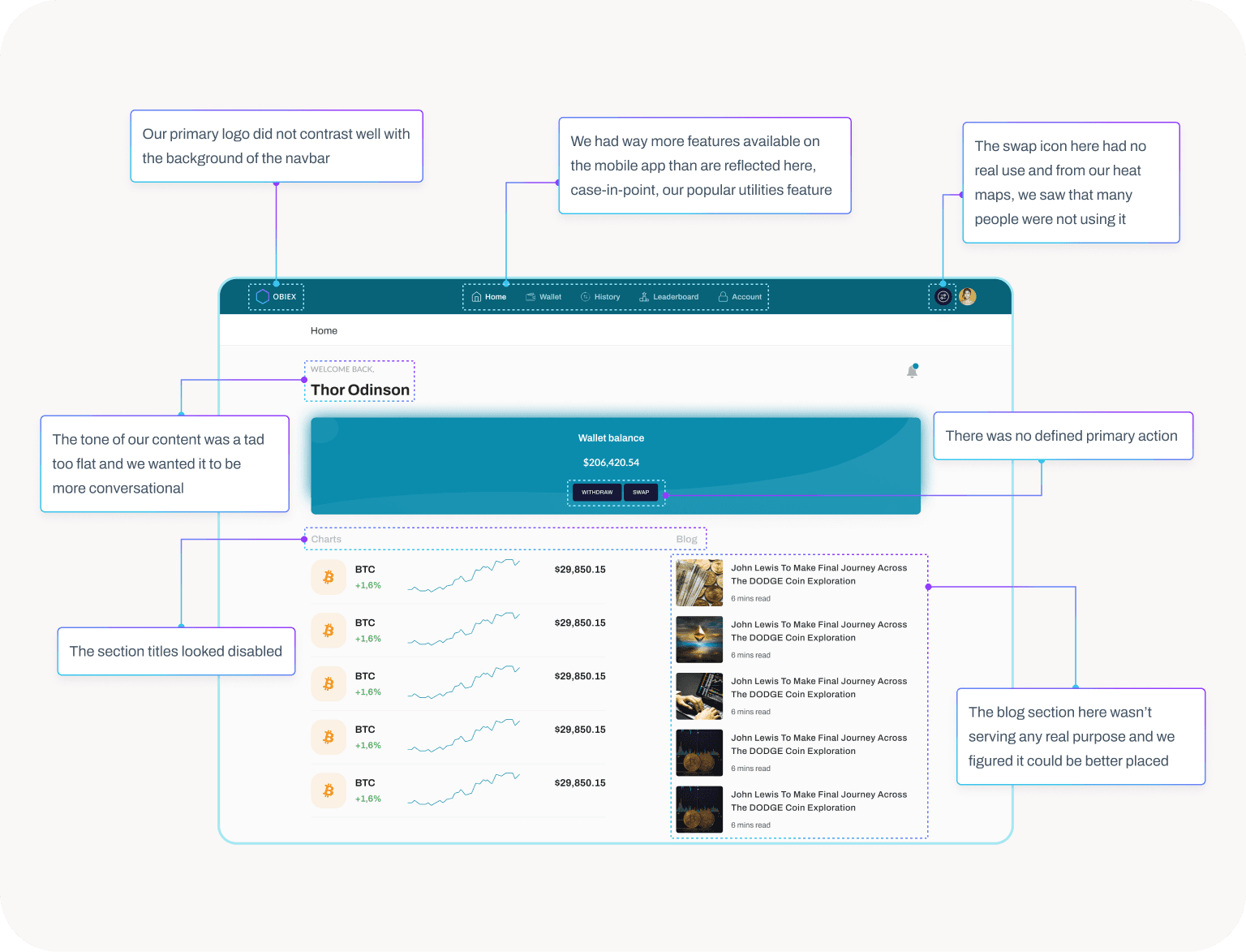
In order to justify our decision, we decided to look inwards (the team) and outwards (user behaviour, feedback and competitive research) to find just what we needed; not one but a truck load of UX issues!
Here’s the thing...
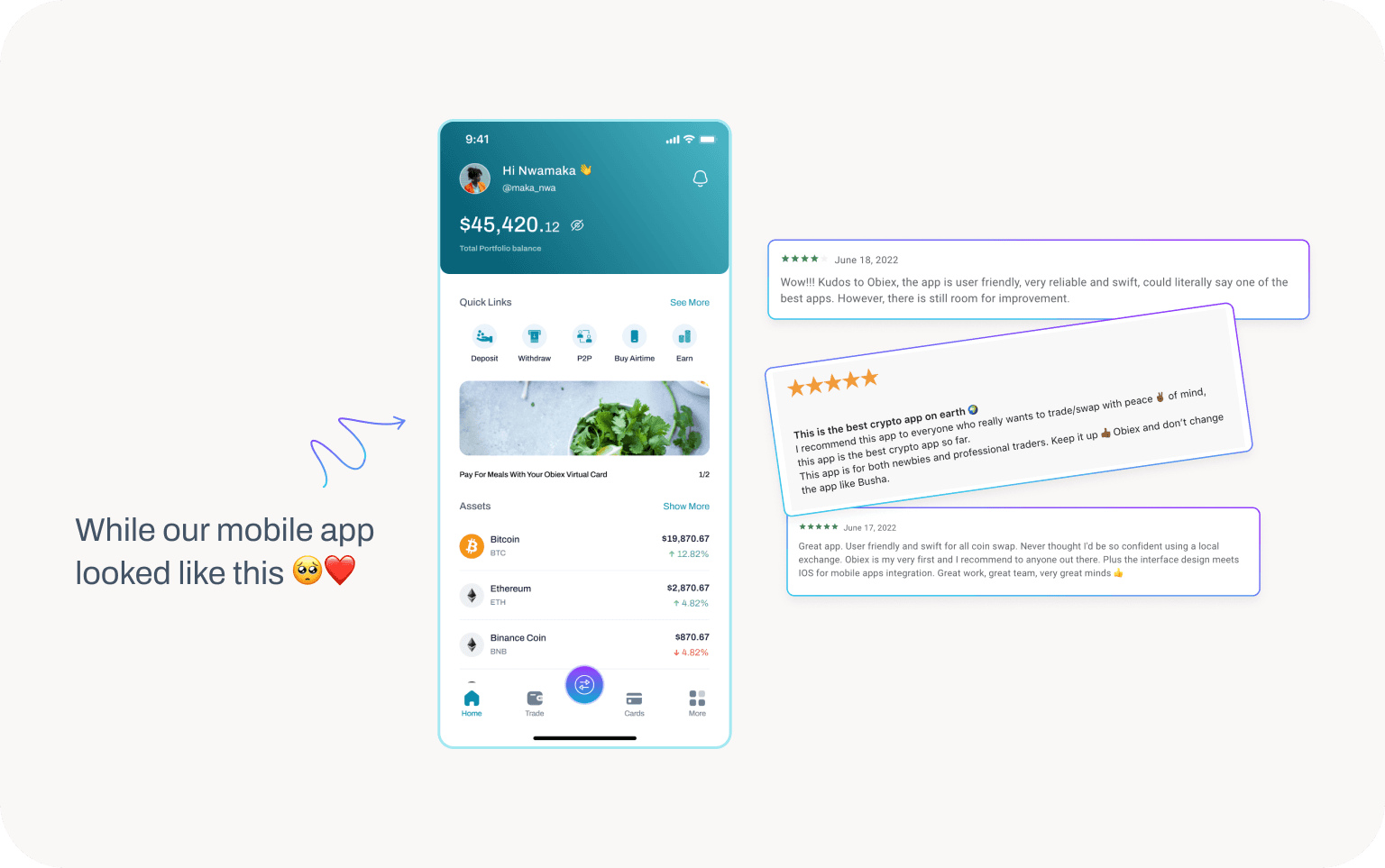
We started the redesign with the mobile app because we had more people using Obiex on their mobile phones than on the web.
After the mobile redesign, we added a few more features to the mix and voila! we became proud designers again, with all the feedback (let’s focus on the positive here) from our new and improved look!
but we still had a bone to pick because
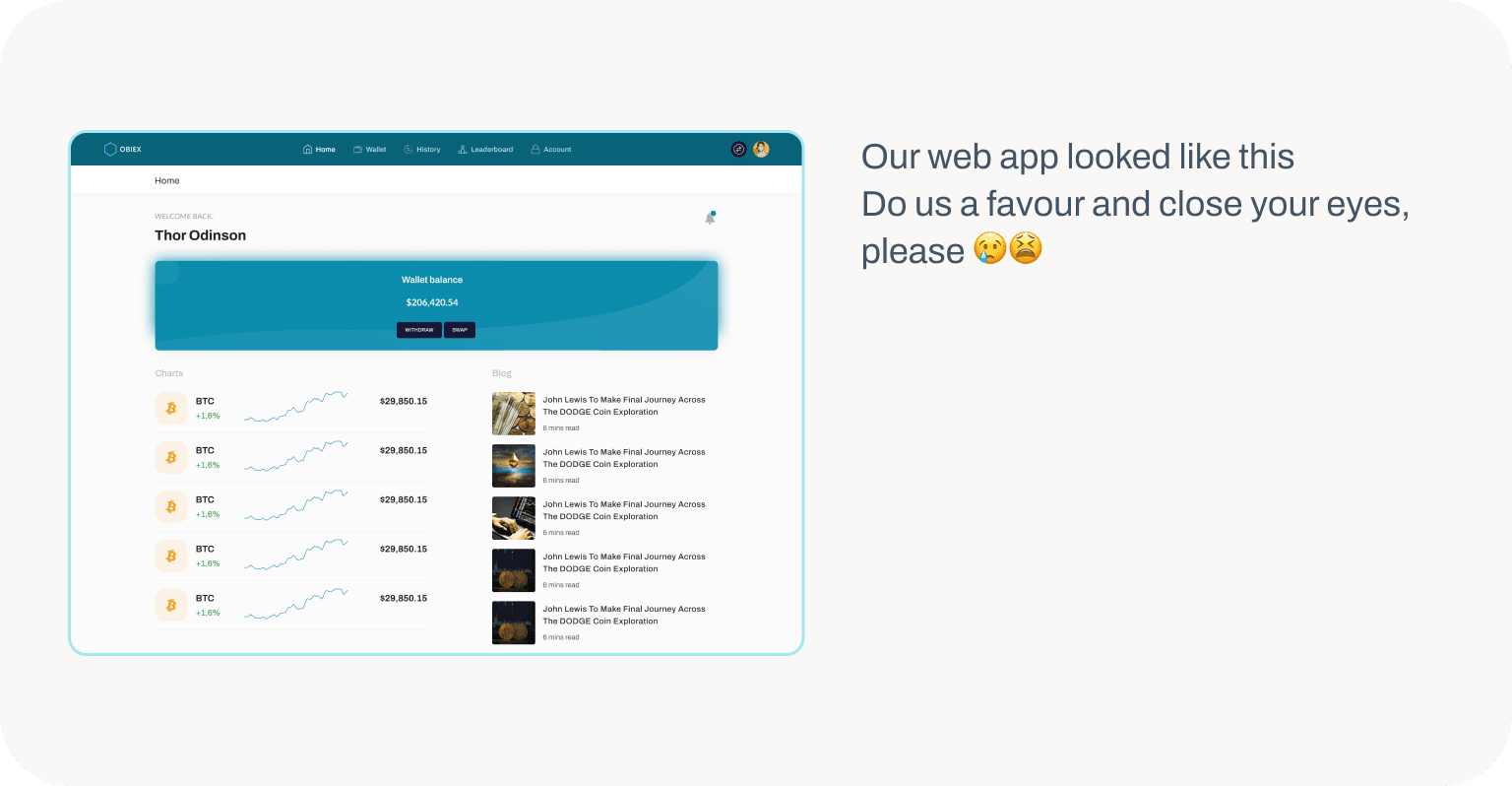
But the look wasn’t the only thing that didn’t sit right with us
For our next trick, we’ll tone the goofy down a notch. Or atleast we’ll try
This is where we would have shown you our low fidelity wireframes, but we didn’t create any. We just took the bull by the horn
Bull. Crypto, get it?
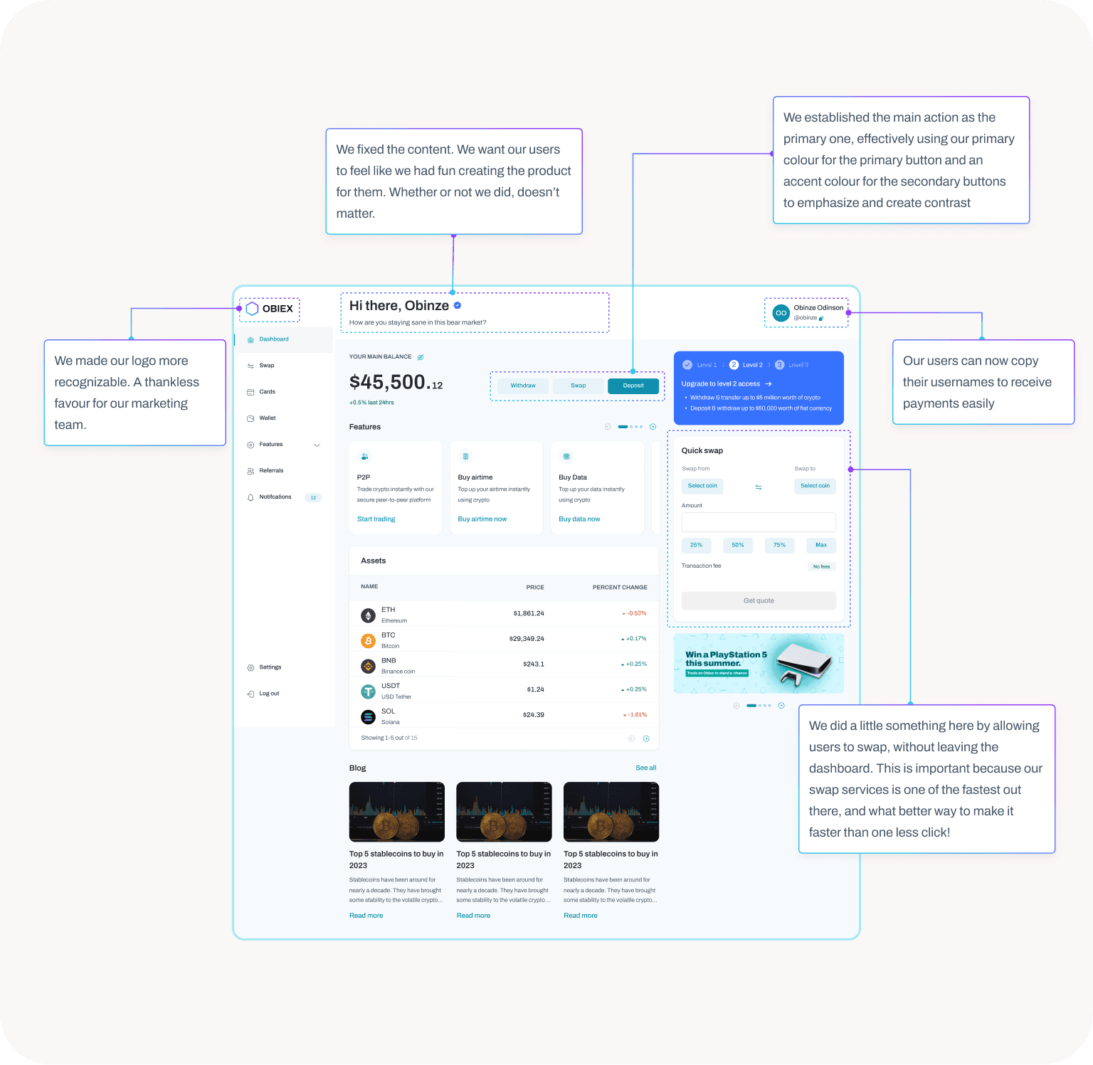
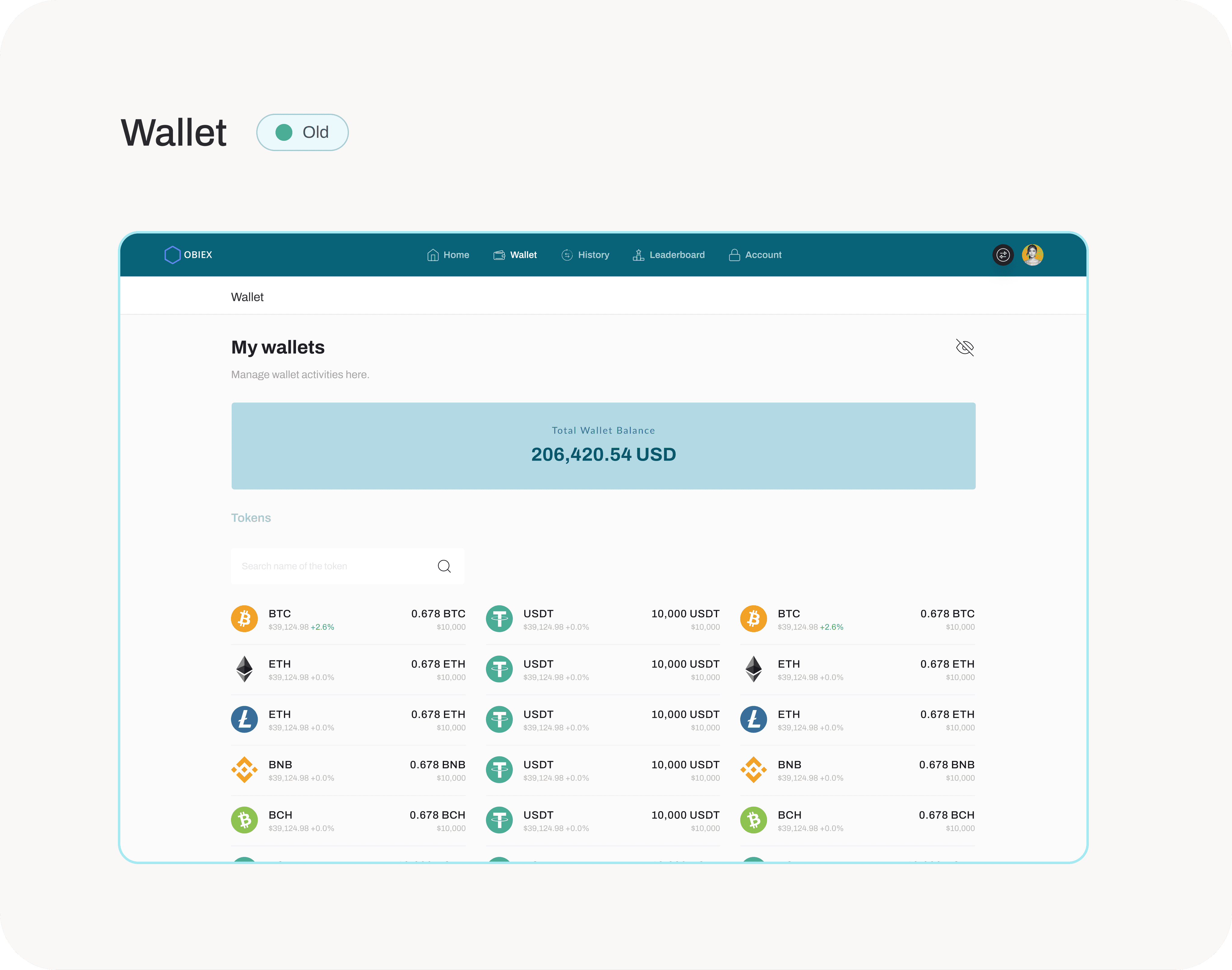
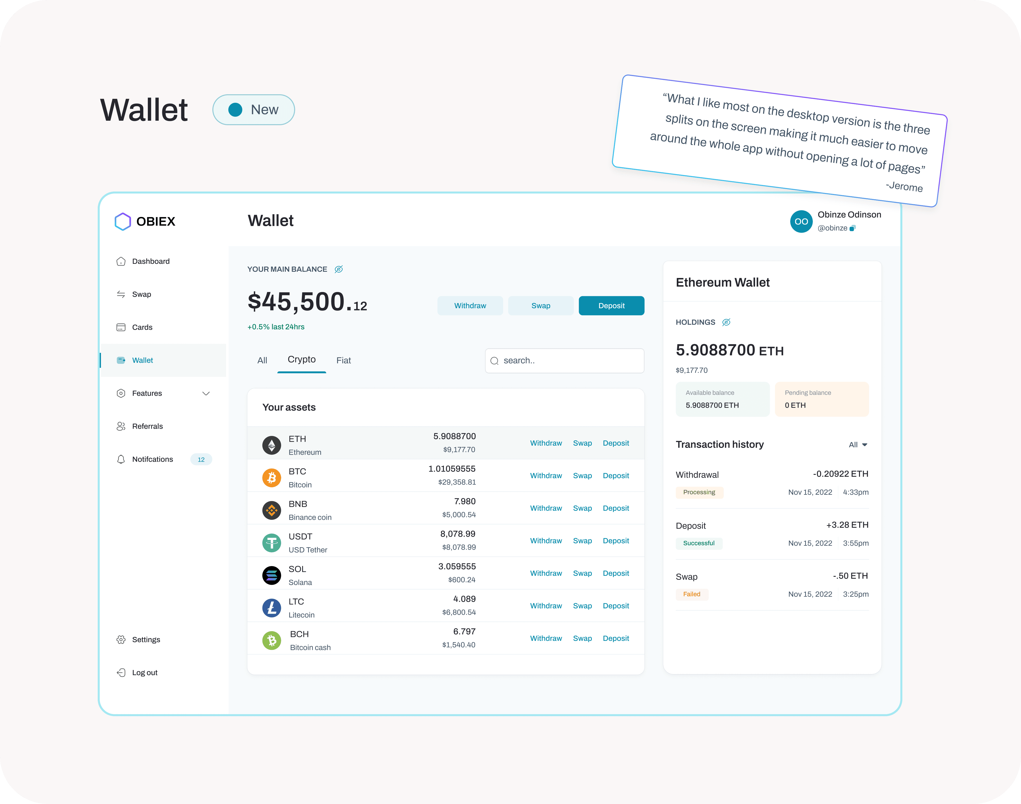
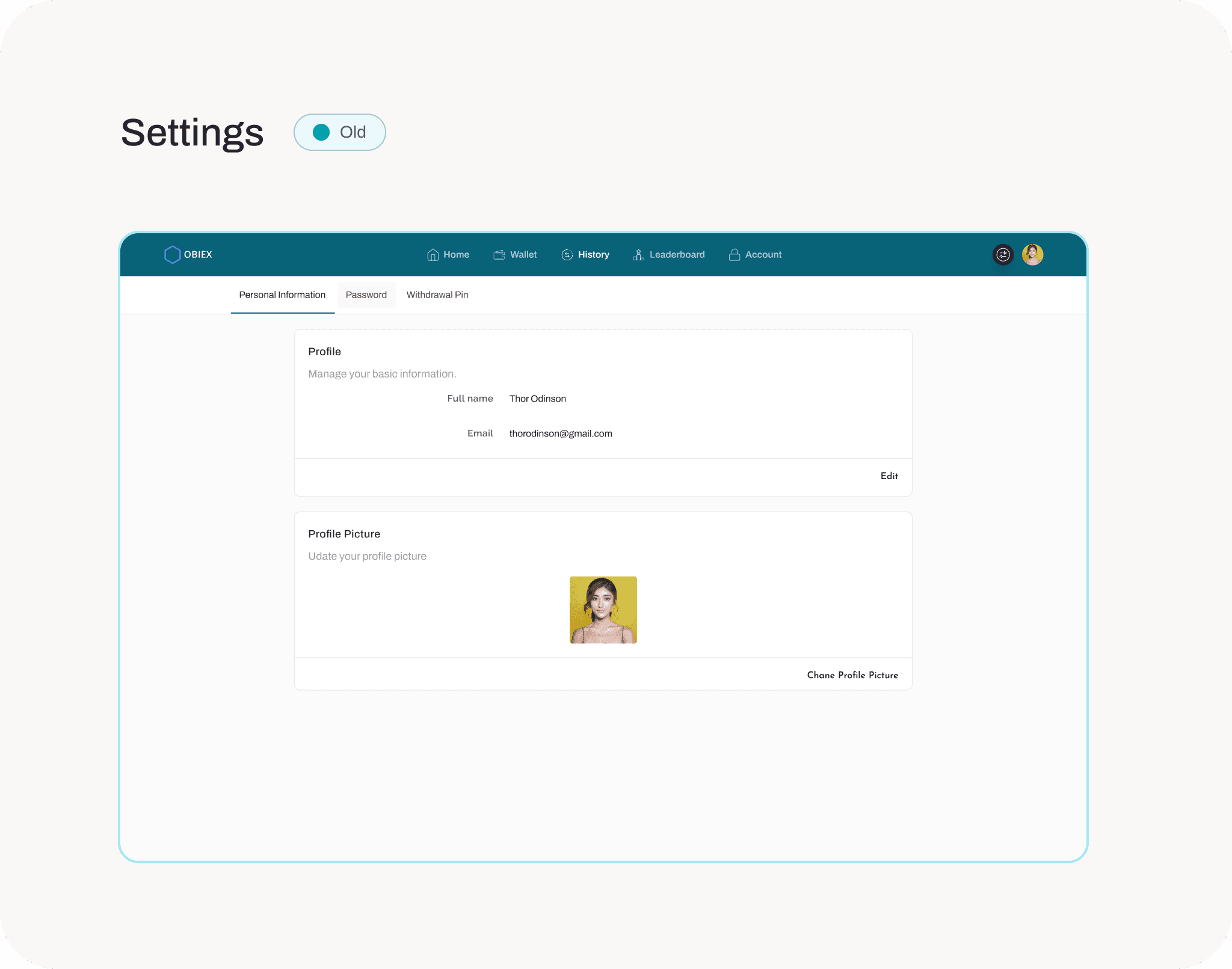
it’s not pride, take a look at our dashboard 🥹
some before and after to show the glow up and the reactions we got!

Surely, we didn’t forget to mention it comes in dark theme!

And it only took us
1000+ Atomic components
50+ Texts and effects styles
3+ Months without sleep
40+ User flows and our tears
we haven’t added the iterations and research! It was an intense period, but it taught us so much. The fact that we can share with you now, makes it so beautiful and worth it.
If you got to this point, you’re the real MVP!
While we would love to show you more screens, we have to stop here because this is already long enough and we can feel your growing impatience, as well as ours. Good news is that the web app is up and running! So go ahead and visit obiex.com to explore more of the UI and UX in real time.
intentionally left blank
breathe.
i'm always open for a chat
whether it’s about building products that are intuitive, easy on the eyes, and full of personality… or just chatting about life, design, or literally anything at all.
Let’s talk. 👋🏽