obiex overhaul: We got to tinkering again, and changed how the Obiex products look
What started as a fix for an event onboarding bottleneck turned into a full overhaul: a full product app redesign, a brand-new design system built on Figma variables, and what not
mobile app

too long, won't read all of that
my Role(s)
i led:
mobile redesign strategy and direction
the compliance-as-checkpoints onboarding model
design system architecture — Figma variables, the token taxonomy, mode-aware semantics, component migration
the templated Figma file structure the whole team uses now
Obi the Bull's integration across the product
the user research that scoped the whole thing
co-conspirators
three key Results we achieved
onboarding event friction collapsed. sign-ups at marketing activations that previously took 10+ minutes (and often got abandoned) now complete in the time it takes to introduce someone to the app.
design time on new screens, roughly halved. once Figma variables, the templated file structure, and the documentation pane were in place.
the customer pain points fulfilled. the pain points we designed against saw measurable drops.
This should probably be a blog post, but… some context
The redesign didn’t start with a brief, it started with a marketing report
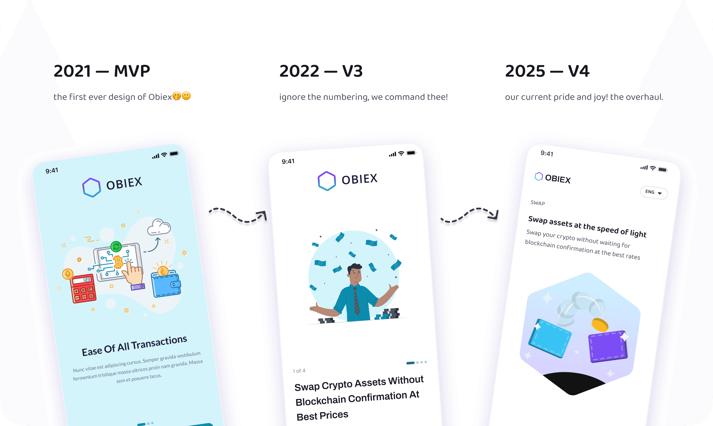
In 2021, we redesigned our mobile app, and the web app in 2022. Classic ‘we found product-market fit, now let’s make it better’ energy — and it was the right call at the time. But as Obiex grew, the product outgrew not just our designs, but also our processes, policies, and the way we approached work.
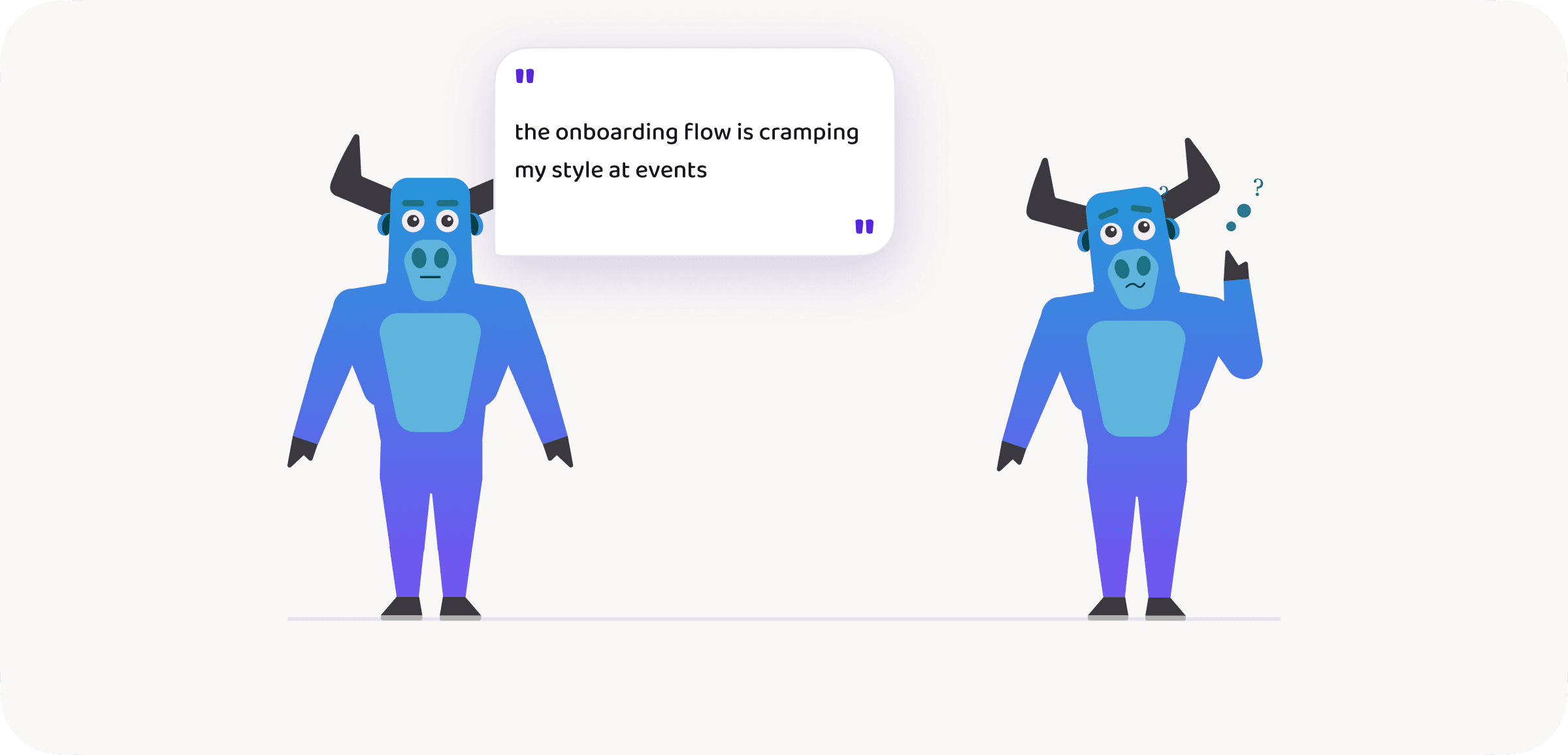
We’d begun extending Obiex into live events when the first real wave hit. Our marketing lead, Ty, was struggling to convert leads — not because his pitch was anything less than impeccable — but because of the onboarding flow waiting on the other side.
We’ll give Ty his flowers — he didn’t come raging at us despite our being the clog (not cog) in his wheel. But he opened up a door we could all see from the corner of our eyes — through every quick fix and patch — yet never dared look into, afraid to find exactly what we did find: a somewhat muddy and dark path.
a lil’ glitch to the flow — just to show the evolution of our onboarding screens… because we can
It was like Pandora’s box, only worse
Problems, problems, everywhere! This is where we should put our problem statement, but…
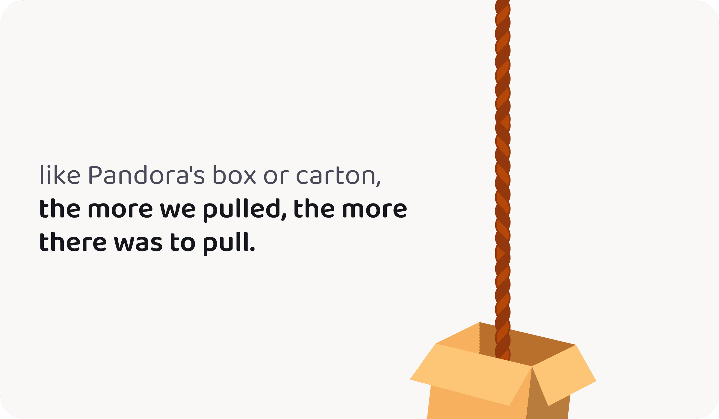
There were many layers, so we couldn’t possibly write just one problem statement. Like mythical box, the more we pulled, the more there was to pull. So here’s a breakdown of how it all went down.
Layer one: The tug of war!
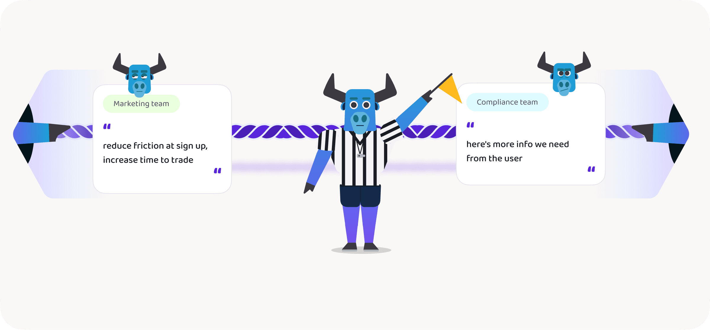
As regulations grew with our scale, the compliance team needed more user information. But our existing approach of collecting it all upfront added friction to an onboarding flow the marketing team was already struggling with. Compliance became a bottleneck for marketing, and we were caught in the middle — figuring out how to serve two very reasonable, very essential needs.
We became referees in our imagined tug of war
No actual fight broke out — but what a blast it would have been!
Layer two: It’s us, we’re the problem, it’s us
What started as a design problem — scattered Figma files, reviews tracked nowhere, a few detached instances here and there — quickly became a dev problem too. Poor handoff flows, disorganised comments, zero documentation, and code components slowly going stale. Not to mention a serious dark mode problem that was costing us real design time.
we’d built a design system once, and quietly thought we’d arrived.
boy were we wrong!
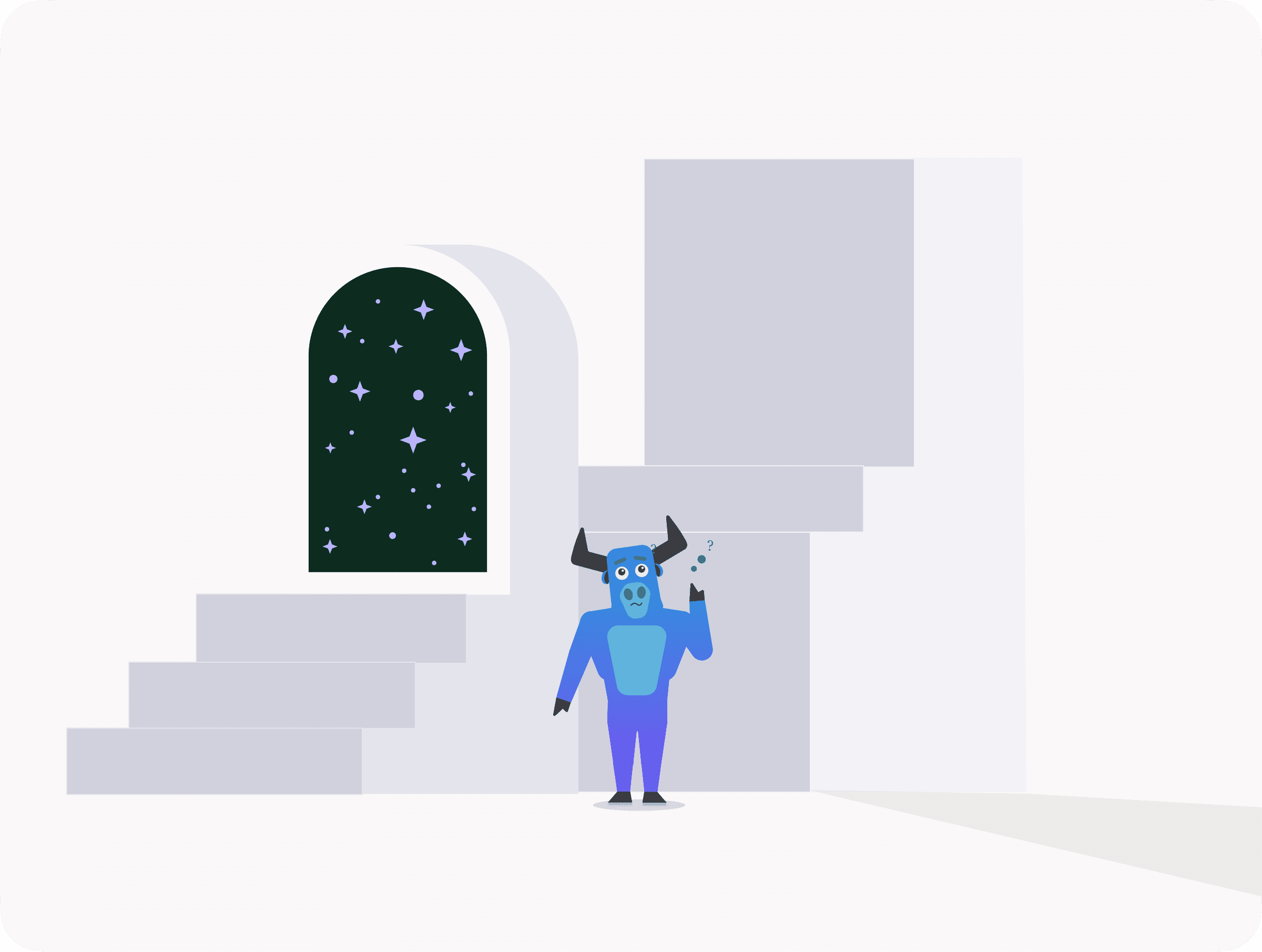
Layer three: The false positives
We consulted our existing customers and found they had very few issues with the product experience — a proud moment. But problems existed nonetheless, and an even harder-to-see problem was users who churned before they ever became customers. As usual, the feedback we gathered was valuable, and every issue has since been addressed by the teams that own them.
we documented some of their comments, not quoted verbatim, with fictional names.
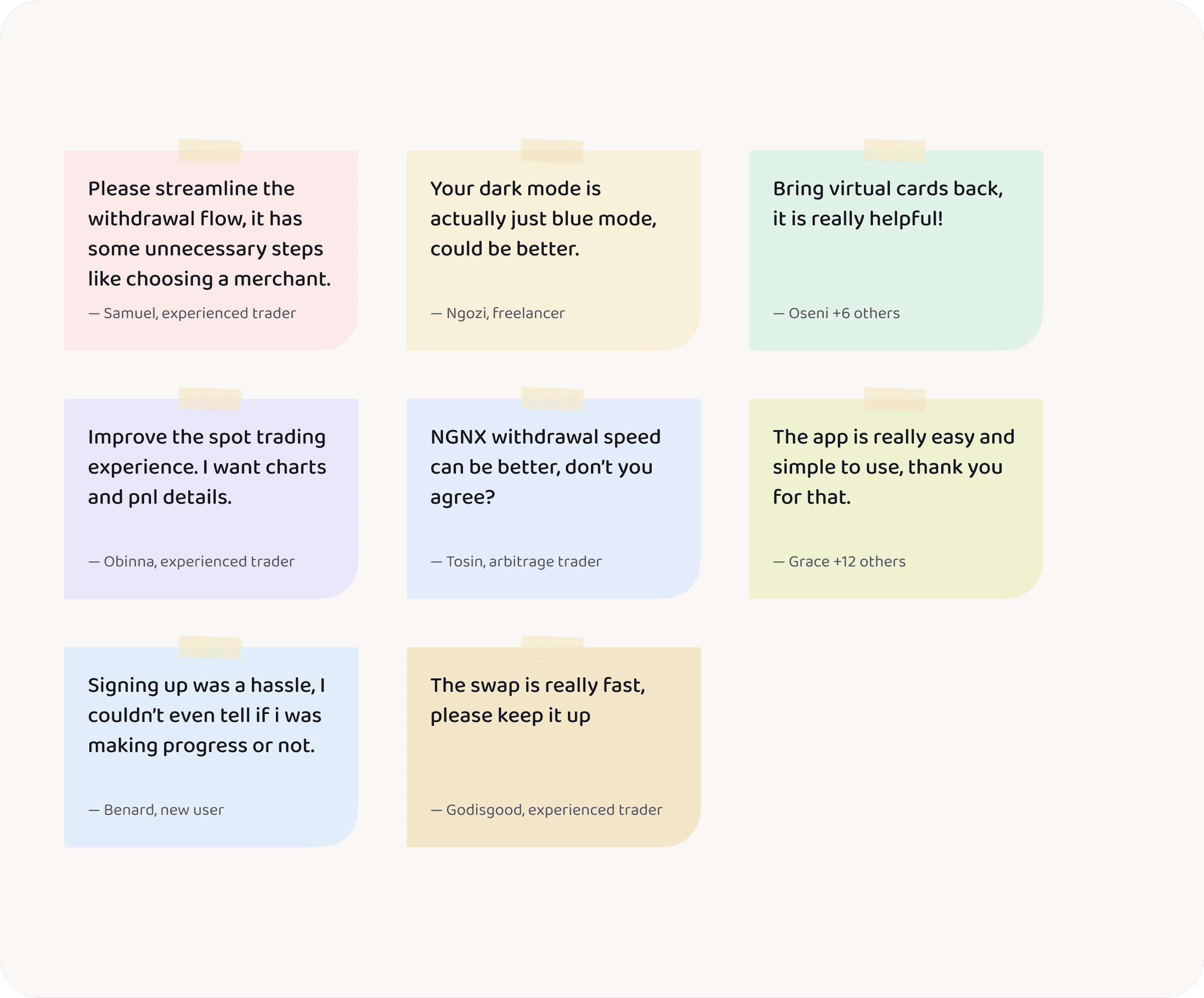
so how did we solve these problems?
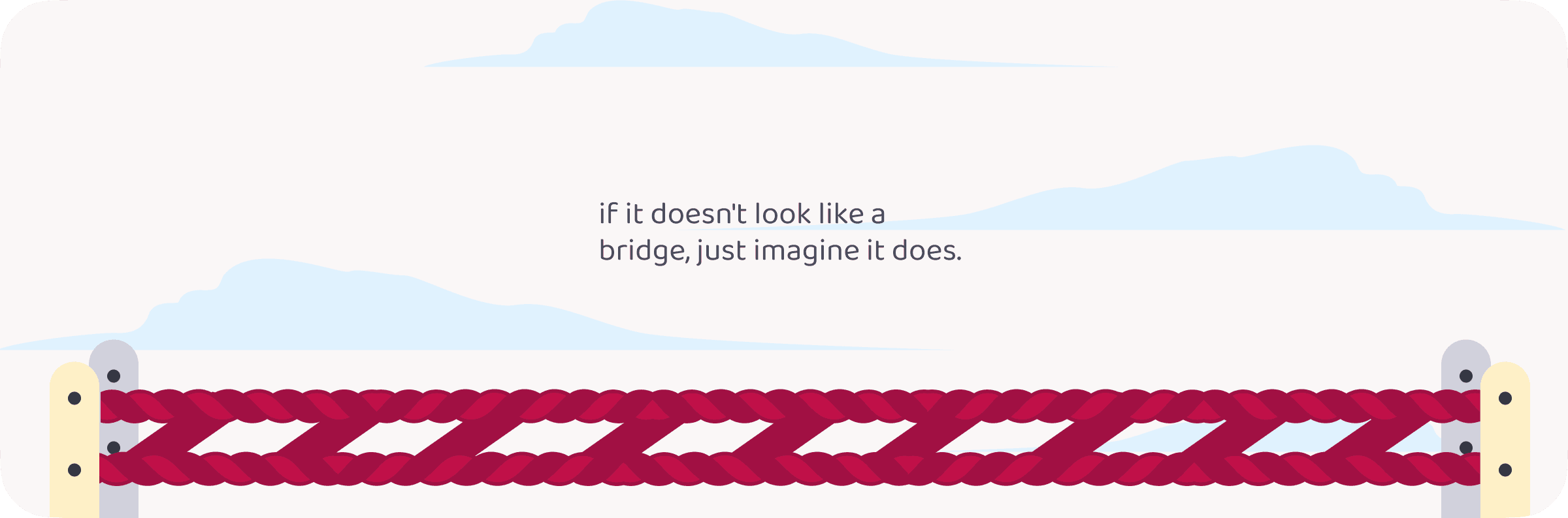
For the tug of war, we turned the rope into a bridge
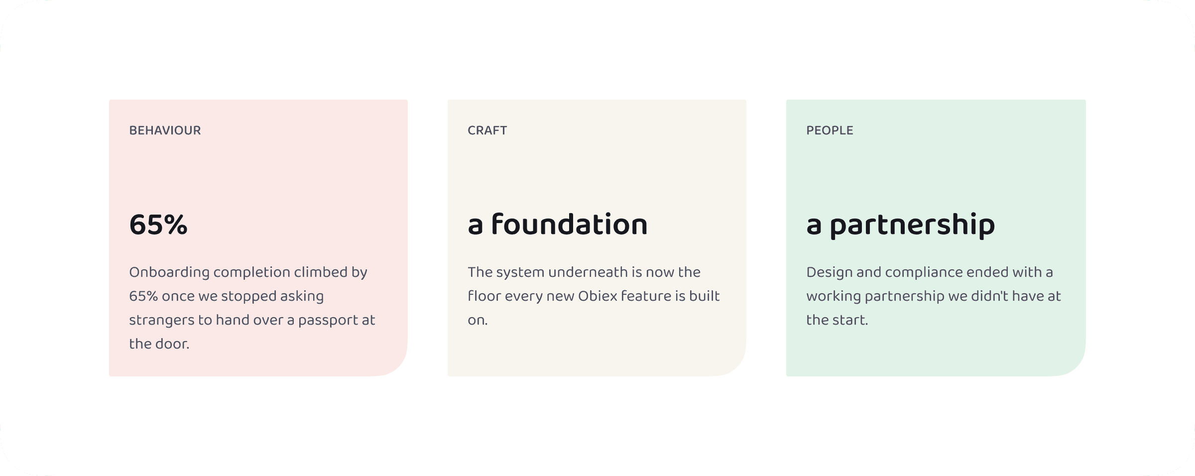
After rounds of negotiation, we landed on a checkpoint system: collect information only when it’s actually needed. Marketing and customers got the fast, low-friction onboarding they wanted. Compliance got every check it required — gathered the moment it mattered, not a second sooner.
The registration screen went from jarring to effortless
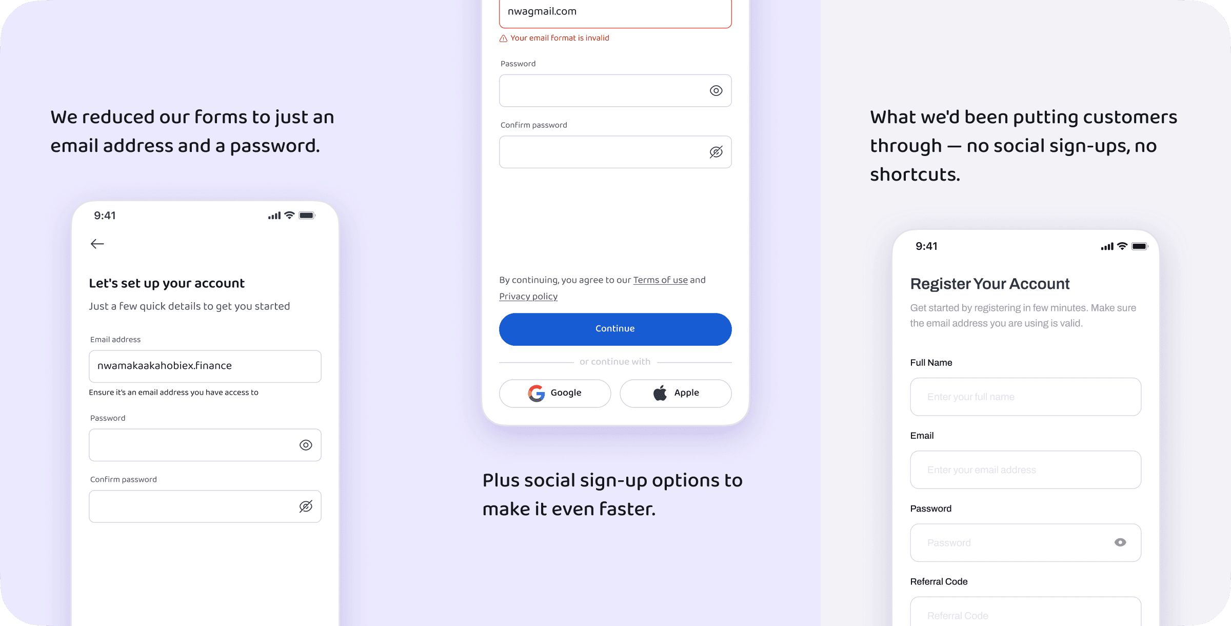
We gave users a chance to explore what Obiex offers before asking for their details — no more checkpoint at the door
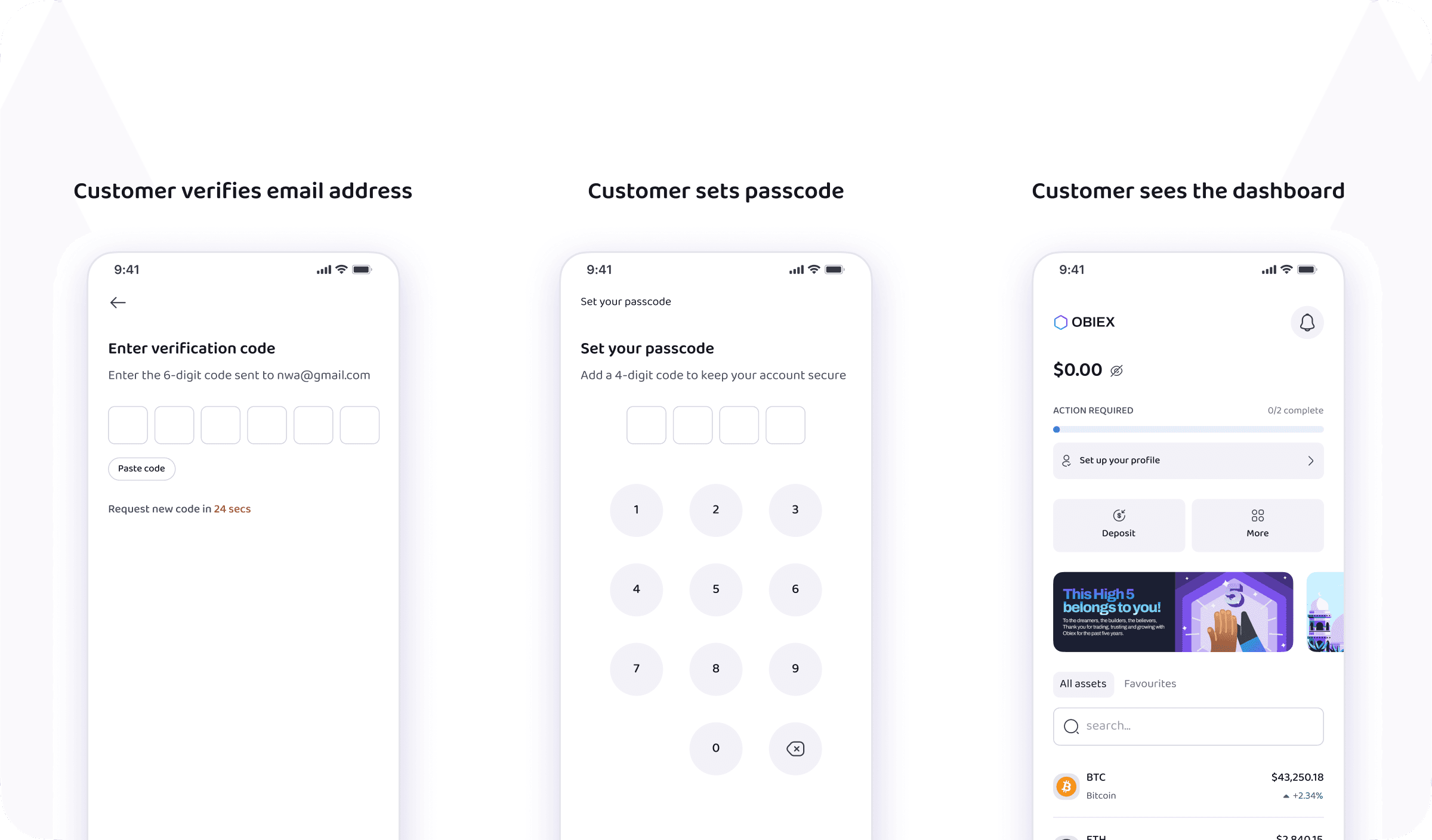
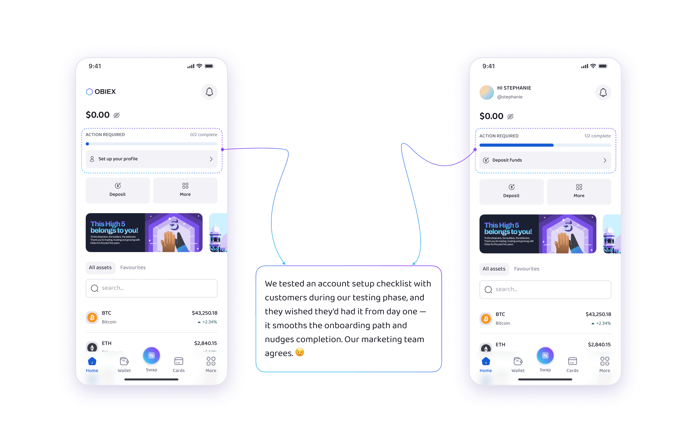
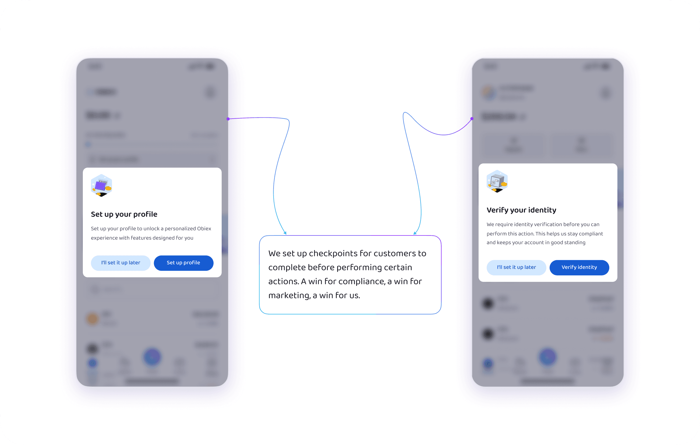
Now, let’s walk through some before and after
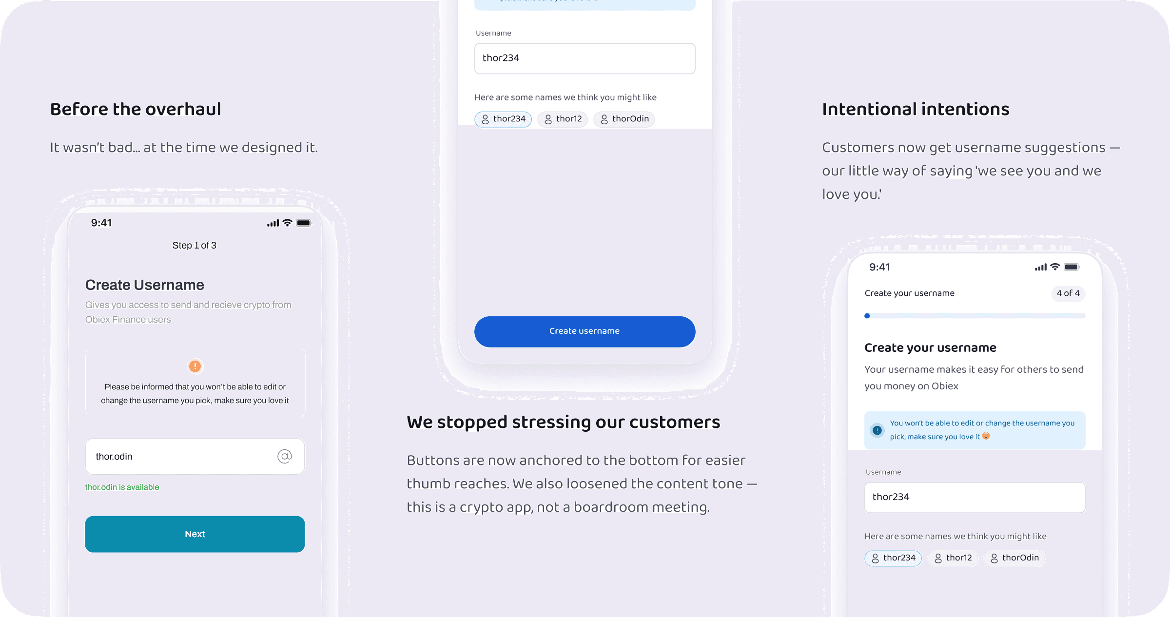
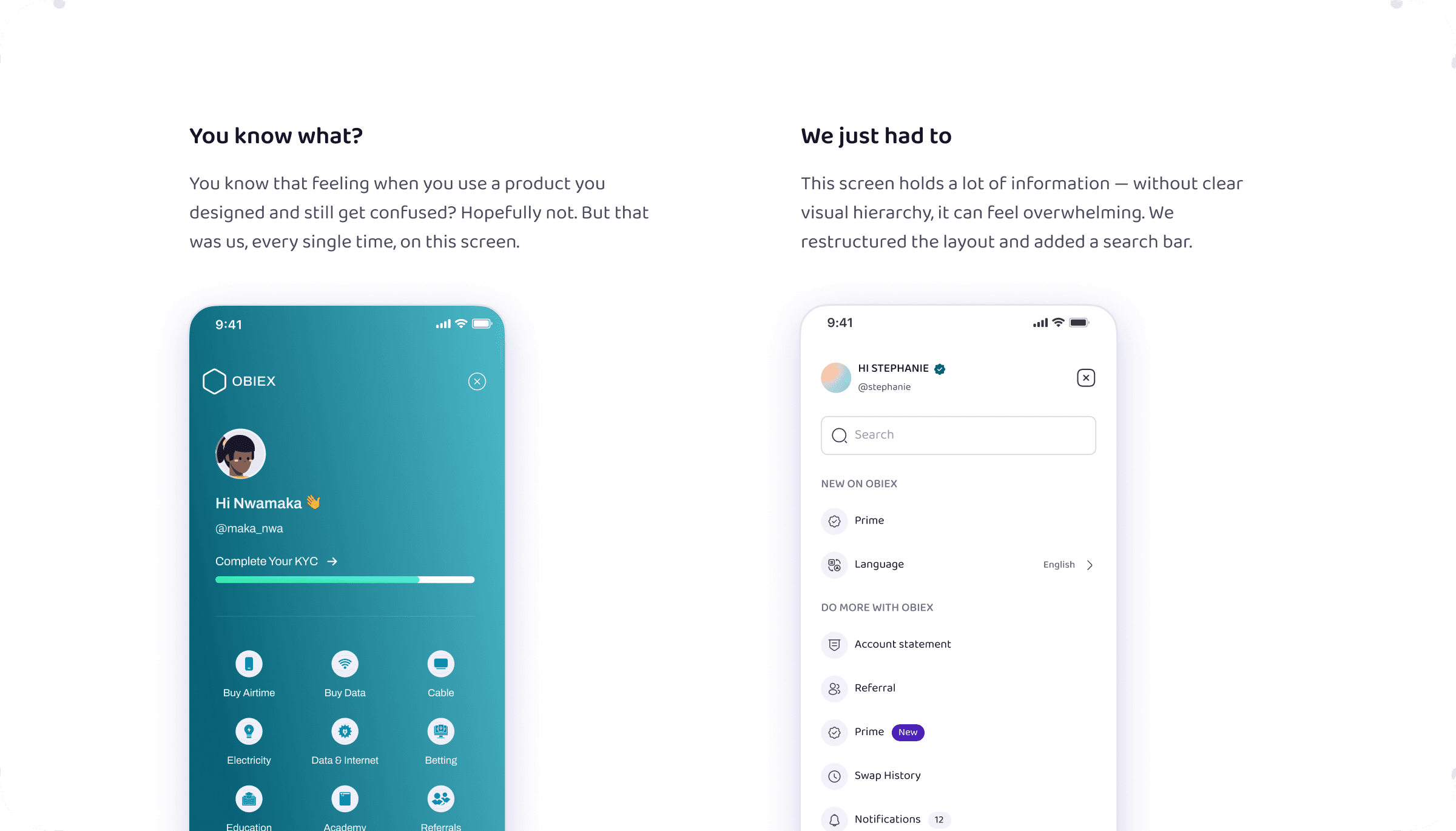
Back to how we changed our customers’ lives… lol. Starting with what they asked for
Our customers are so great — they don’t ask for much.
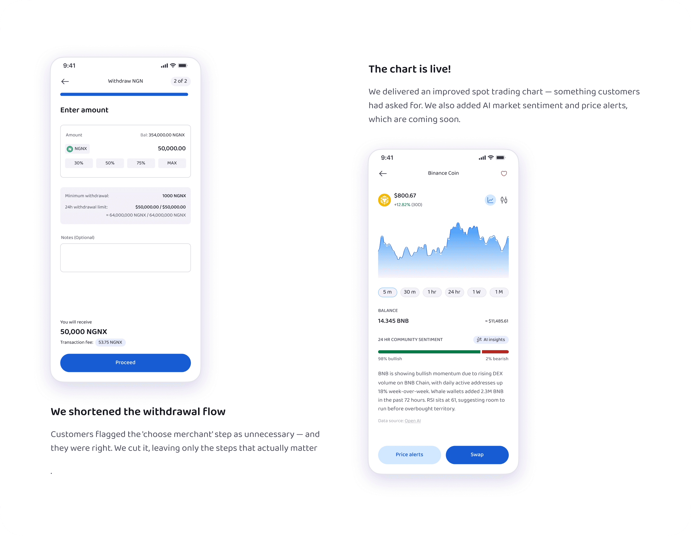
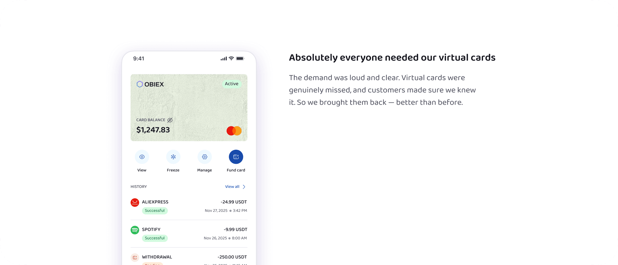
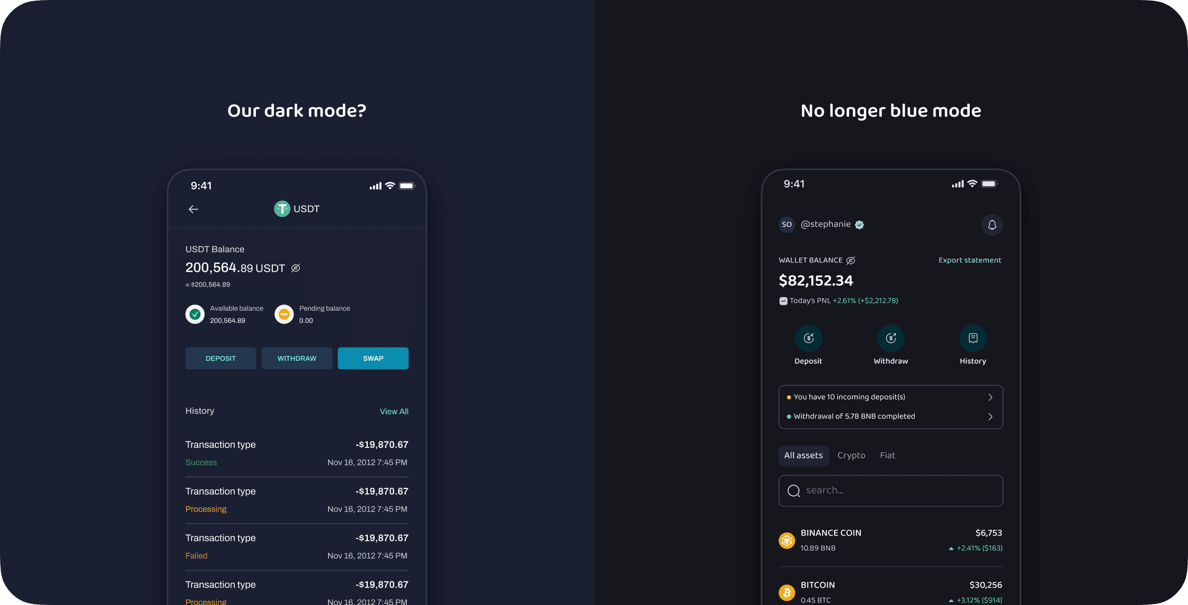
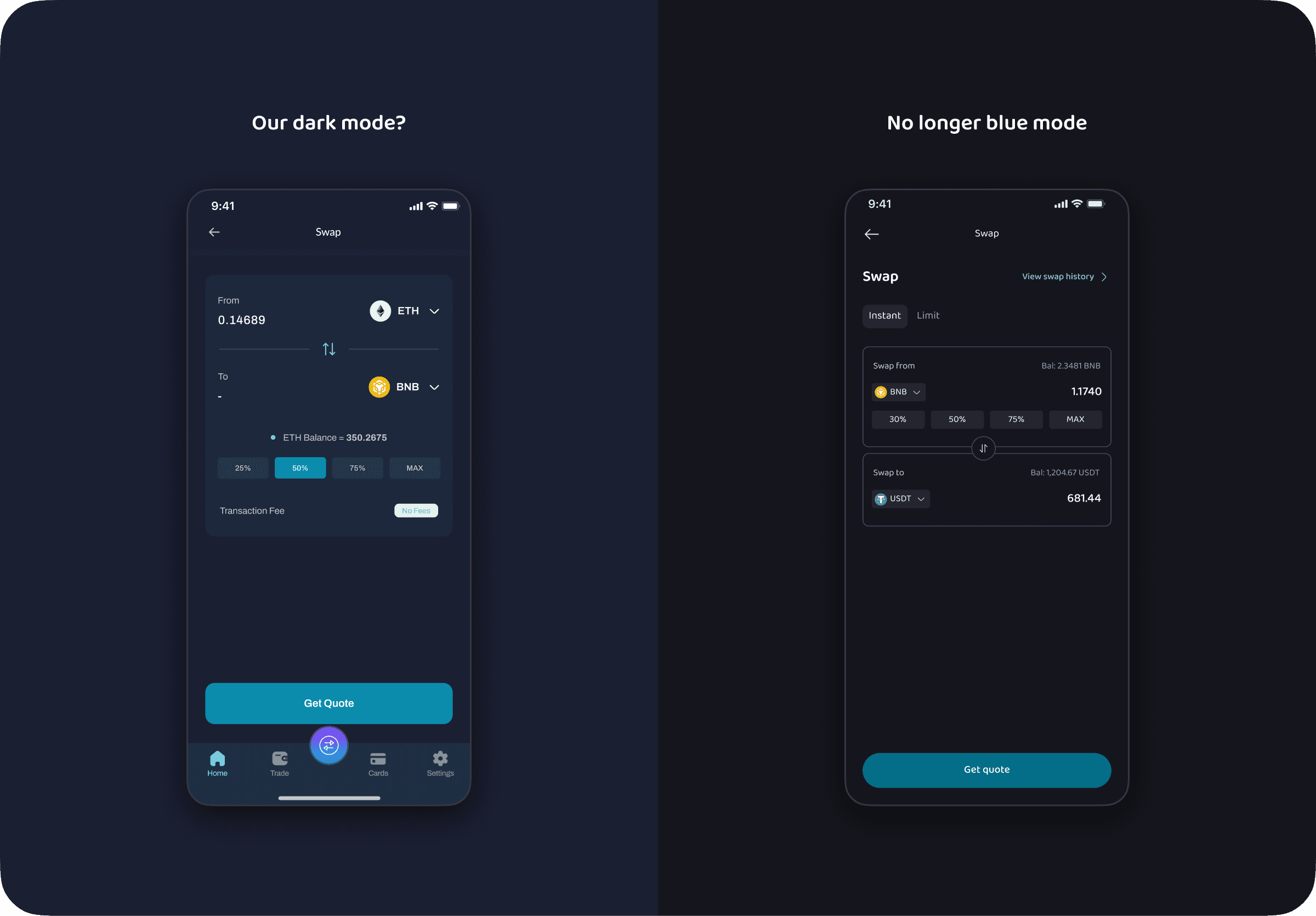
and now to things they didn’t even ask for
Aren’t we great?!!
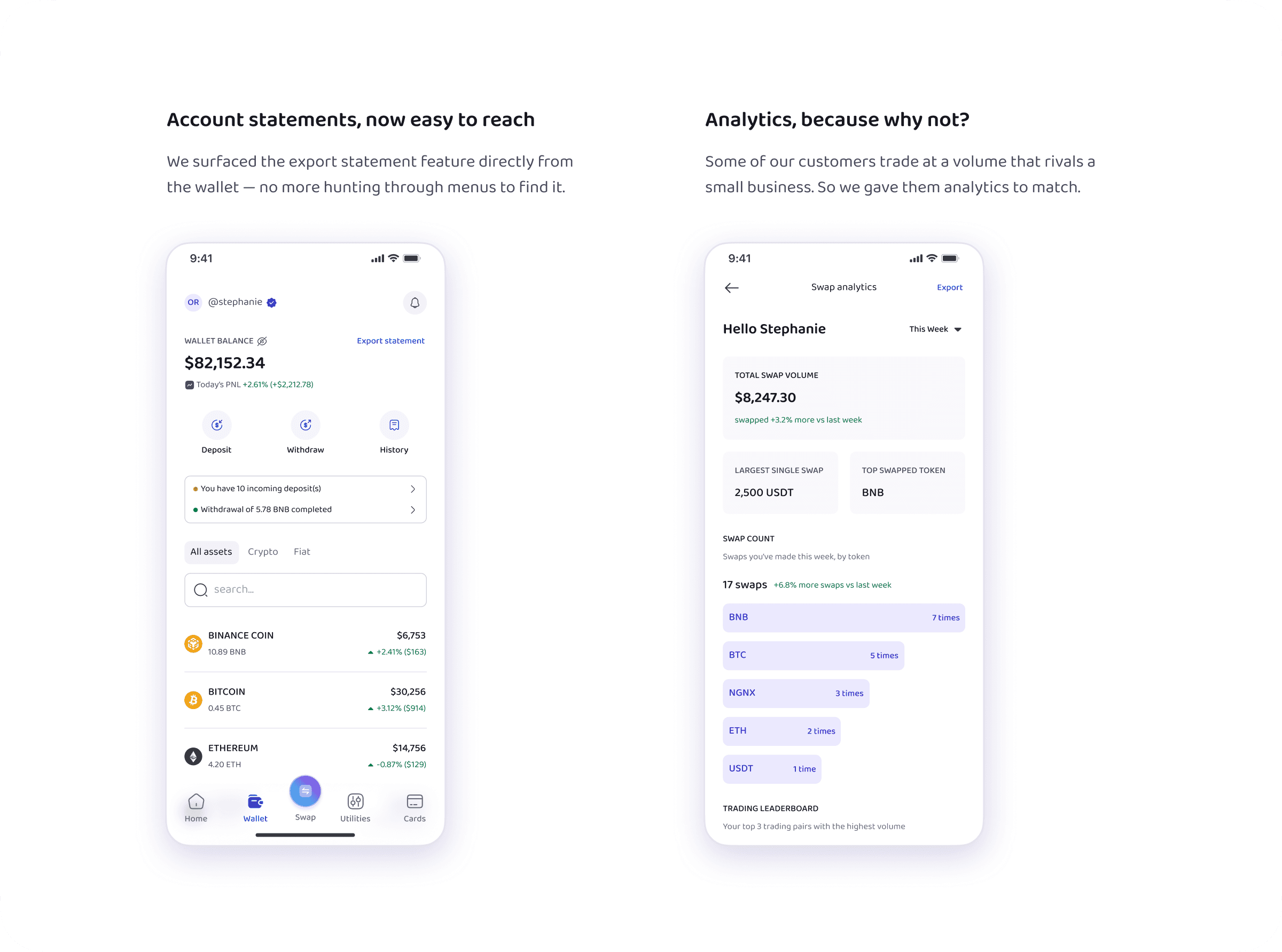
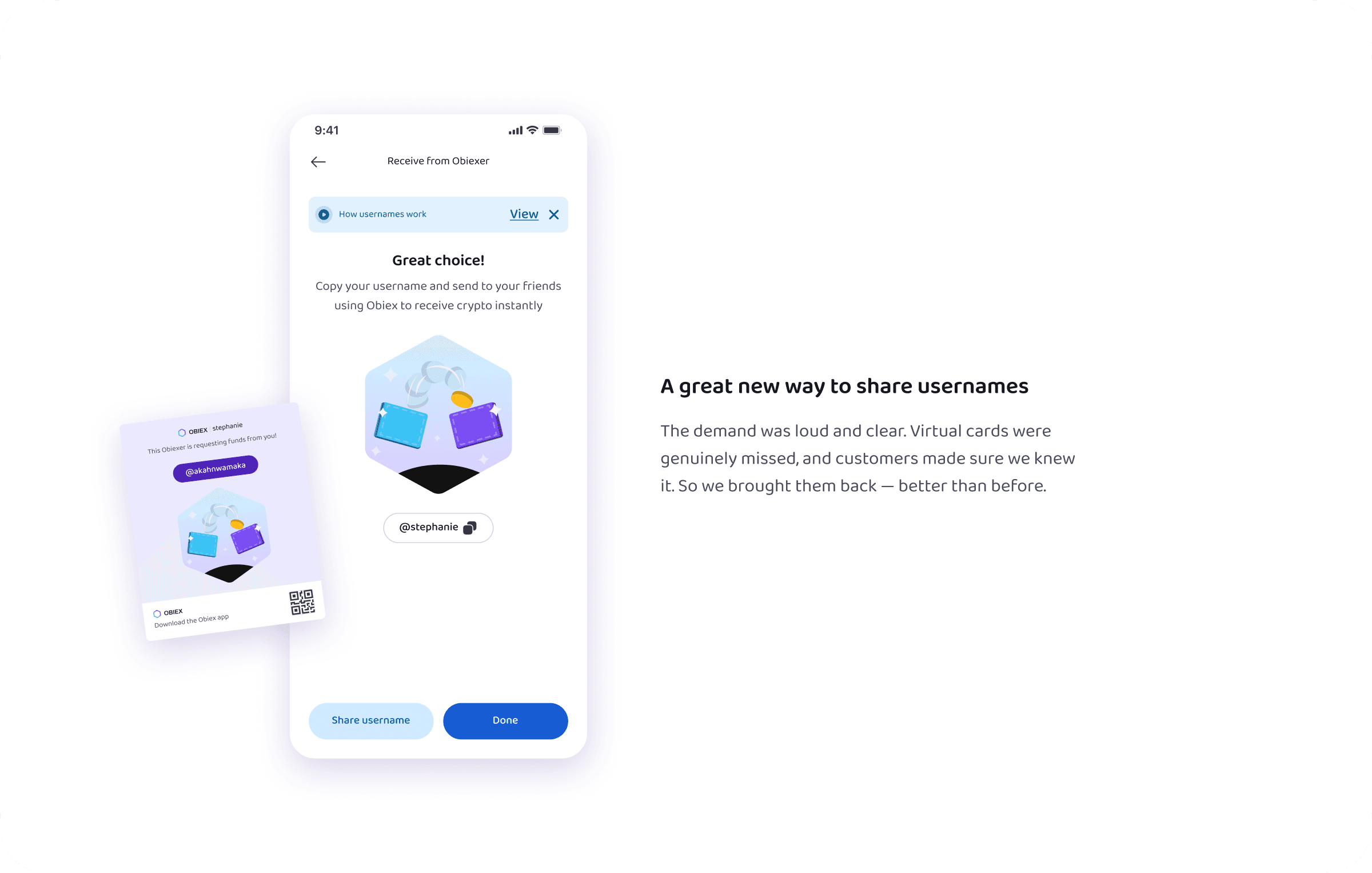
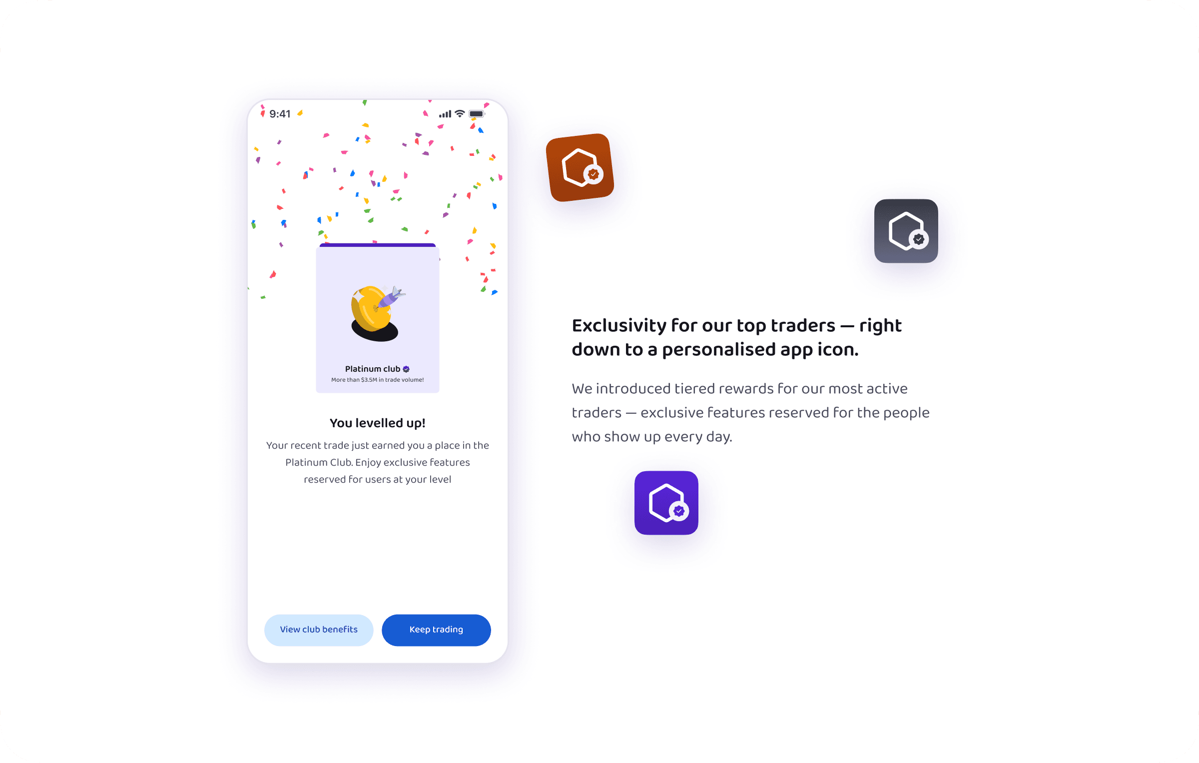
None of this happened on the rust-and-rails of the process we’d been limping along with
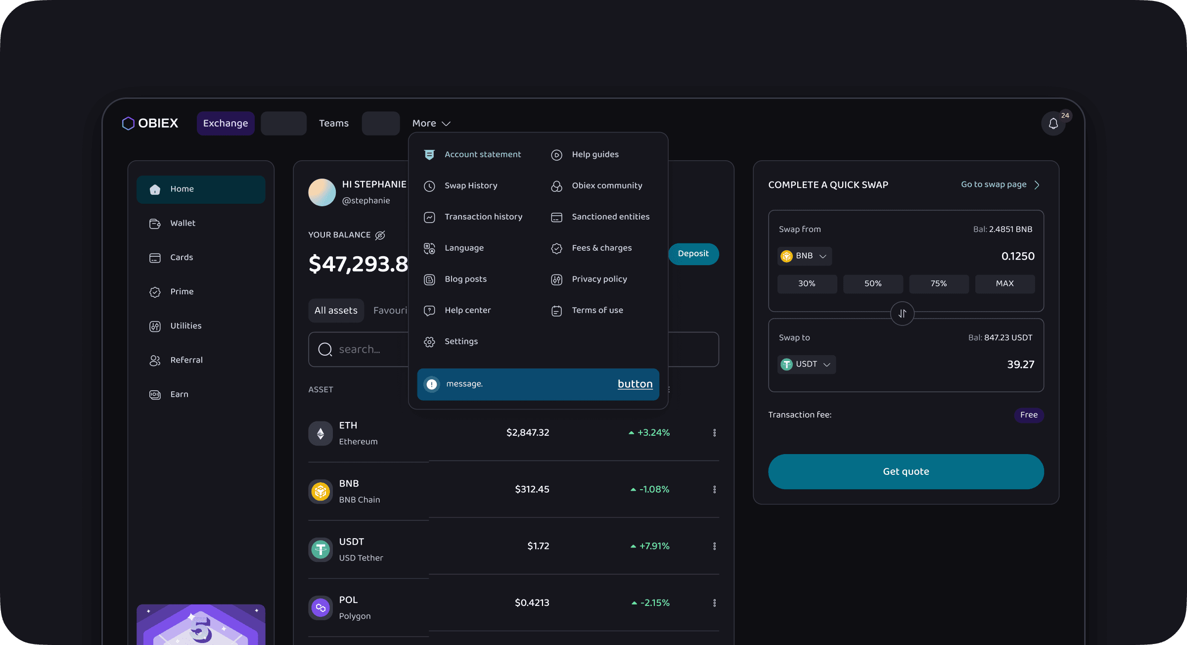
The first thing we did was clean house. Variables, tokens, and components rebuilt to scale rather than just to ship — and a Figma structure that treated documentation and change tracking as first-class citizens, instead of the thing you always mean to do later and never do.
We’d share the actual structure, but that one’s staying our trade secret.
jk — we’re writing a proper case study on that. Stay tuned. For now, here’s our design system, just like every other Behance case study shows it.
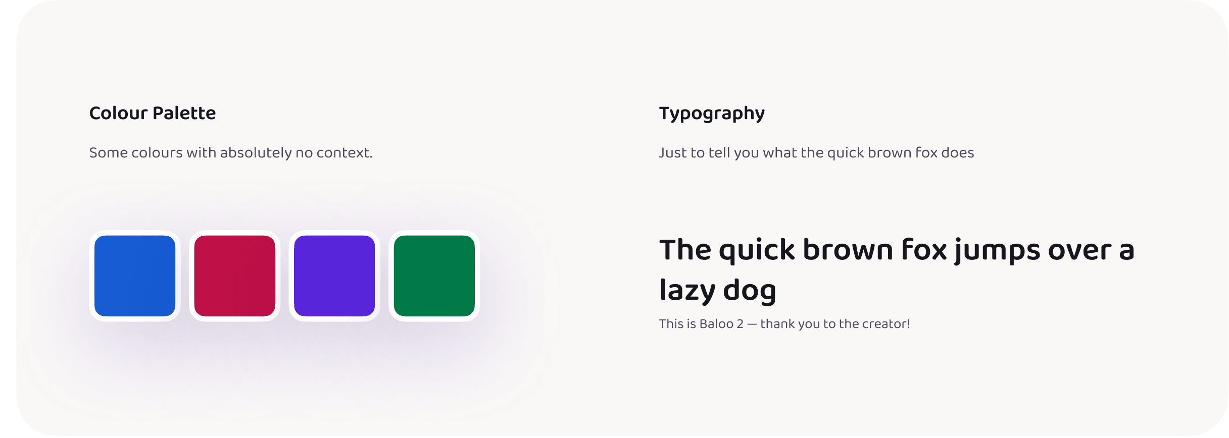
We’re also building a Storybook for it — it’s a work in progress, but you can view it here
we also worked on the web app, but it’s for a whole ‘nother case study
Three things we walked away with
we got some comments we’ve now taped to our wall of love
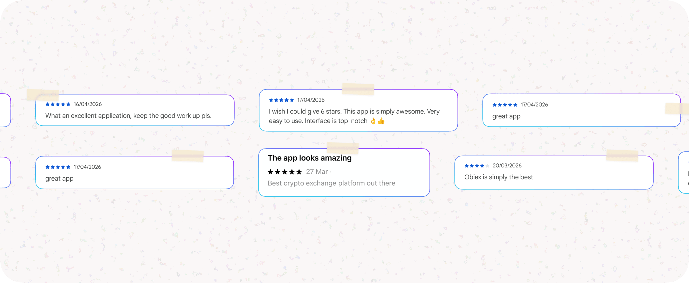
the reviews we got were mixed. we also got plenty of pushback — mostly within the team, during stress testing before anything reached customers. But it was all real, and every piece of friction became a useful insight that sharpened what we shipped.
It’s a continuous process — which is exactly why we said ‘almost right.’ We keep growing.
love, and design🌸
intentionally left blank
breathe.
i'm always open for a chat
whether it’s about building products that are intuitive, easy on the eyes, and full of personality… or just chatting about life, design, or literally anything at all.
Let’s talk. 👋🏽